During the course of the last month, we released two new features you might want to take note of.
We’d also like to take a look at 3 lesser-known features that’ll help you better use Data Sources.
Enjoy 🍸

New Features For Easier Data Management
Before we get stuck into how you can manage data sources with less effort, let’s look at our two new features for this month…
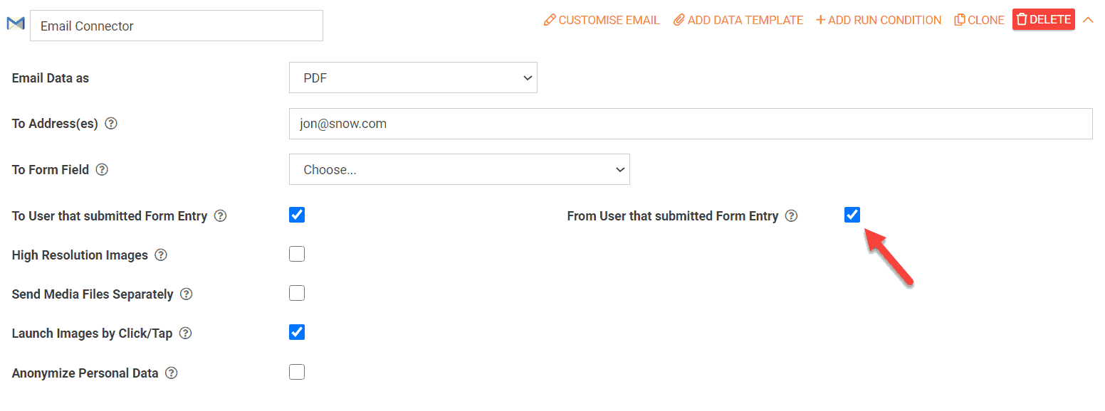
“From” Field Populated By User Data On Email Connectors
By default, the “From” details on emails sent by our Connector will show as your company name and sender address, as configured in your organization setup.
With this option selected, the submitting user’s email address and name will be set as the “From” information instead.
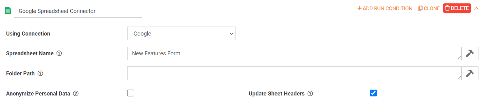
Added A Checkbox To The Google Sheets Form Connector To Update Headers
When enabled, the Google Sheet headers will be updated each time the connector is processed.
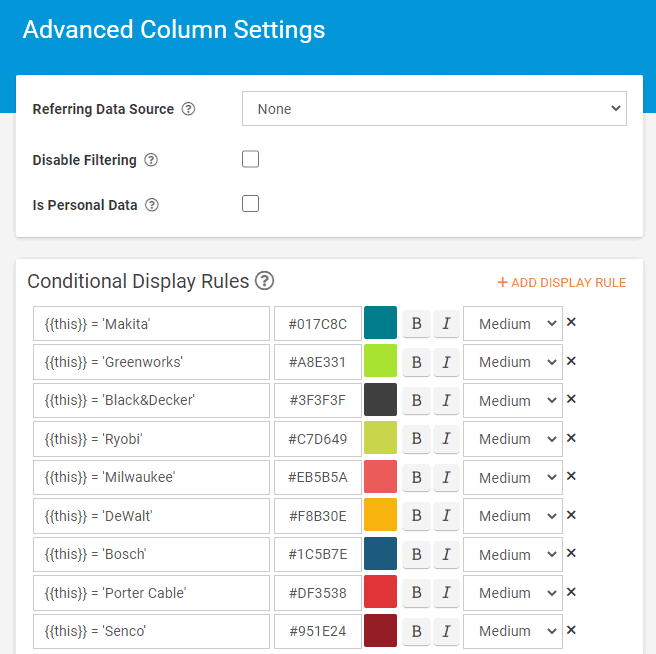
1. Conditional Display Rules on Data Sources
Did you know you can colour-code Data Source column data? This makes it a lot easier to differentiate between, for example, different brands.
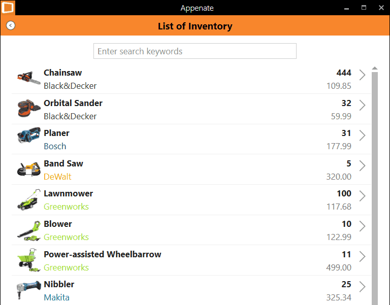
By setting colours based on certain conditions, you can make your Listing, Mapping, and Choices fields more eye-catching and organized.
Access this feature by clicking on the settings cog on a column in your data source.
2. Default Row Display
The Default Row Display property allows you to control how your rows in the Data Source will appear on the app by default. You can find this on the settings page of a Data Source and under the advanced options section.
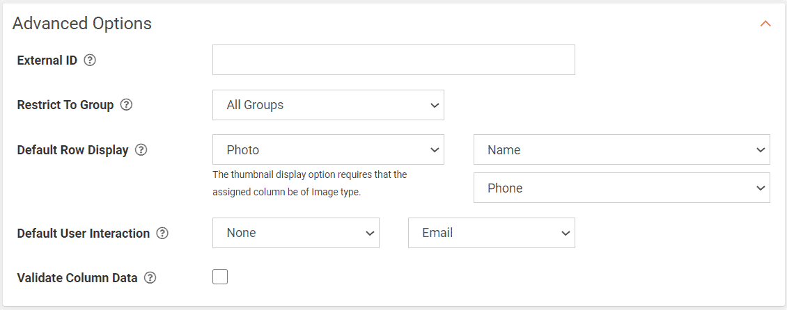
Image type columns can also appear as thumbnails on each row by assigning the thumbnail position.
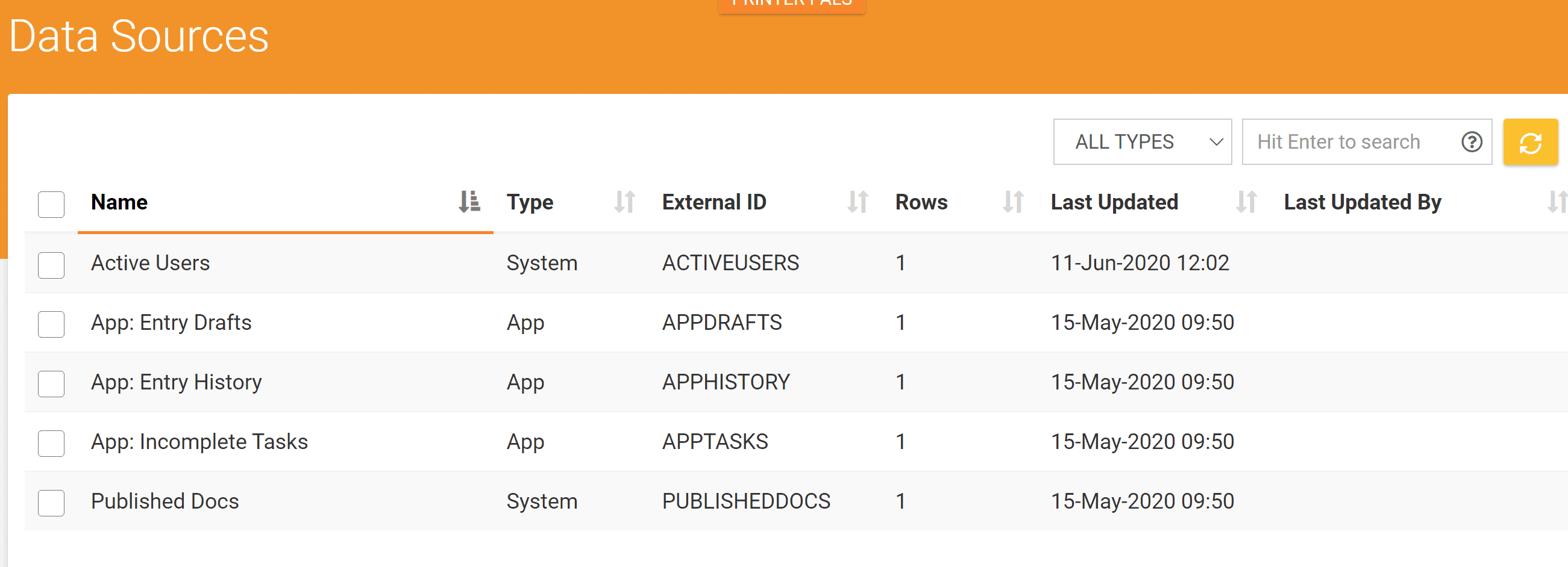
3. Built-In data sources (Active Users, Incomplete Task, Drafts, Published Docs)
We provide a few Built-in data sources with your Appenate account. You can use these data sources within your solutions.
For example, enabling users to email other team members with the output from their form entry. Using the Active Users data source bound to a choices field, your user can select the team member they’d like to email.
You could also create Listing screens to view your Entry Drafts, Entry History, Incomplete Tasks, and Published docs.
Stay safe.